Ranking The Top Kits In Professional Track
Ranking The Top Kits In Professional Track
With the US Championships on the horizon, it's time to look at who has the best uniforms of the 2019 season.
Unlock this article, live events, and more with a subscription!
Already a subscriber? Log In
We've ranked every event heading into the USATF Outdoor Championships. So what's left? How about what the athletes will be wearing in Des Moines.
It is my pleasure to introduce you to the first edition of the Kit Rankings.
Am I qualified to comment on fashion? Definitely not and my recent wardrobe choices can attest to that. But alas, I have opinions, strong ones, about who is winning the jersey race this year.
Let's get ranking!
1) Bowerman Track Club
BTC remixed their red tops from previous years with a more animated design. Even before the change, I liked the BTC red and their logo with the lightning bolt through the letter "B." Black and red is a great combination. In this edition, they build on an existing color scheme that most distance fans associate with the club.
The more reserved among us might be asking a simple question:
Why is there a game of laser tag taking place on Matthew Centrowitz's chest? I prefer to see it as a spin on one of those plasma globes that were in your cool science teacher’s classroom. In short, these jerseys pop and aren’t too busy.
2) Oregon Track Club
I prefer the classic green to the white, though both are sharp. The color is synonymous with Oregon and is one of the few jerseys with a historical connection. Like BTC, they have the market cornered on a color.
My only complaint is the tree--the best logo of all the track and field clubs--isn’t bigger (boo logo restrictions).
3) New Balance
They always have reliably interesting uniforms--usually white and black with a bright color thrown in there. The result? They are easy to spot in a crowded pack.
Last year, it was bright orange highlights. This year, it’s bright green.
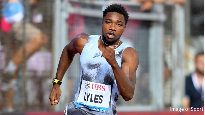
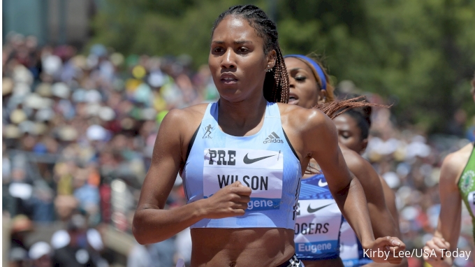
4) Adidas
It’s more subtle than most of the other kits, and it’s probably the least memorable part of Noah Lyles’ outfit. But they aren’t bad and the distressed look with the black and grey is nice.
Ajee' Wilson has worn a different Adidas kit that isn’t as busy. I like the simplicity and nobody else is in teal this year.
5) Nike (black and grey)
Similar format to the standard Nike jerseys, but these ones are only for athletes who were ranked #1 in the world last year. I’m not a huge fan of the split/two-tone look, but the exclusivity and intimidation factor help them stand out.
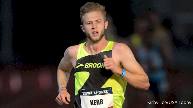
6) Brooks
I’ve seen two versions of the jersey this season. There’s the yellow with black highlights, worn by Josh Kerr here:
And the solid black that Allie Ostrander and Karissa Nelson are wearing in this photo.
We interrupt our regular scheduled program of “#BeingABeast” to announce our newest members. Both NCAA champions. Both Beasts. Today is their day!??@allie_ostrander @MerryKarismas pic.twitter.com/tqMPDtnNwu
— Brooks Beasts TC (@BeastsTC) July 3, 2019
Brooks has worn the bright yellow for years now (points for consistency), even that awkward year when Nike decided to use the exact same shade and distance races were just roving packs of highlighter yellow.
As a viewer, the dependability is helpful when trying to figure out who is who in a large pack. It’s also useful to have a color that is wildly different from the others
7) Nike (blue and green)
Blue on one side and then a blue/green scramble on the other. Because Nike sponsors such a high volume of athletes, these are ubiquitous in the Diamond League. Maybe they thought if they split the jersey in two it would add variety to a homogeneous collection of jerseys. One twist I would be in favor of, keep the split and customizing the colors by nationality.

8) Nike Oregon Project
Like the Bowerman Track Club, they made a switch this year. Their previous iteration was simple, sharp and stealth--all black with the white skull logo. It captured the ethos of the group perfectly.
For 2019, they threw a bit of color in and I’m not fully prepared for the whimsy.
Yes, that is blue, red and green swirled in there. Come for the fast distance runners, stay for the Rorschach test. Laptop screens have trouble transmitting everything that is happening on the front of that jersey.
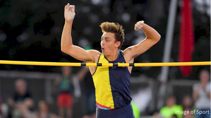
9) Puma
We can’t have two companies doing split jerseys in the same year. And yet, we do.
I’m not sure which jerseys went into circulation first, but since Nike has such high volume they certainly have been more visible than the blue and yellow kits from Puma. They are slightly off-center (more blue than yellow), which I guess makes them different, but the design and color scheme isn’t noteworthy. The result, they look like the JV version of the Nike jerseys. Come on Puma, let's get creative for 2020!